A leap of imagination
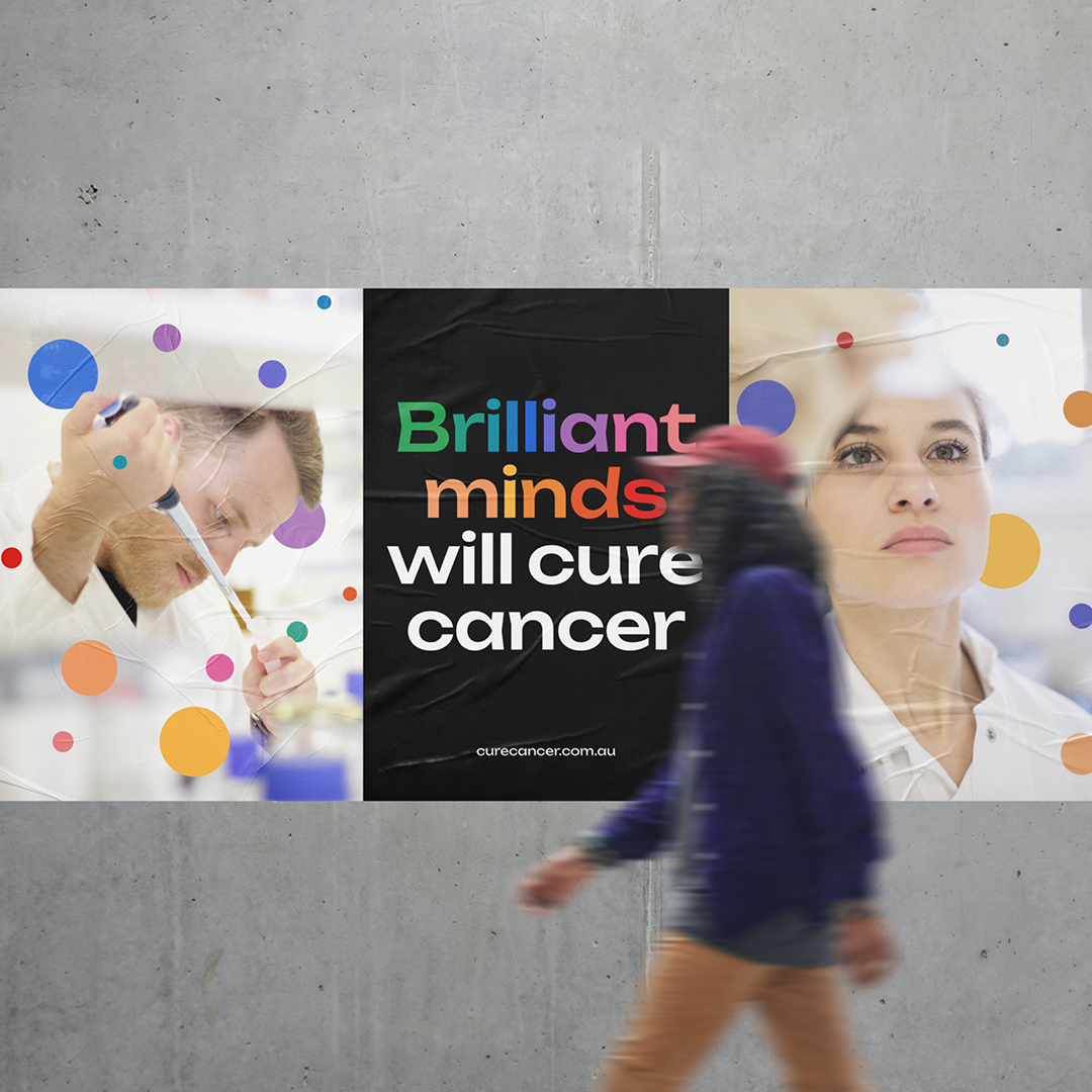
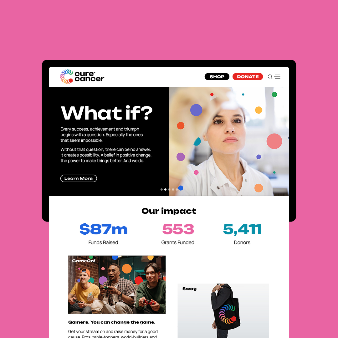
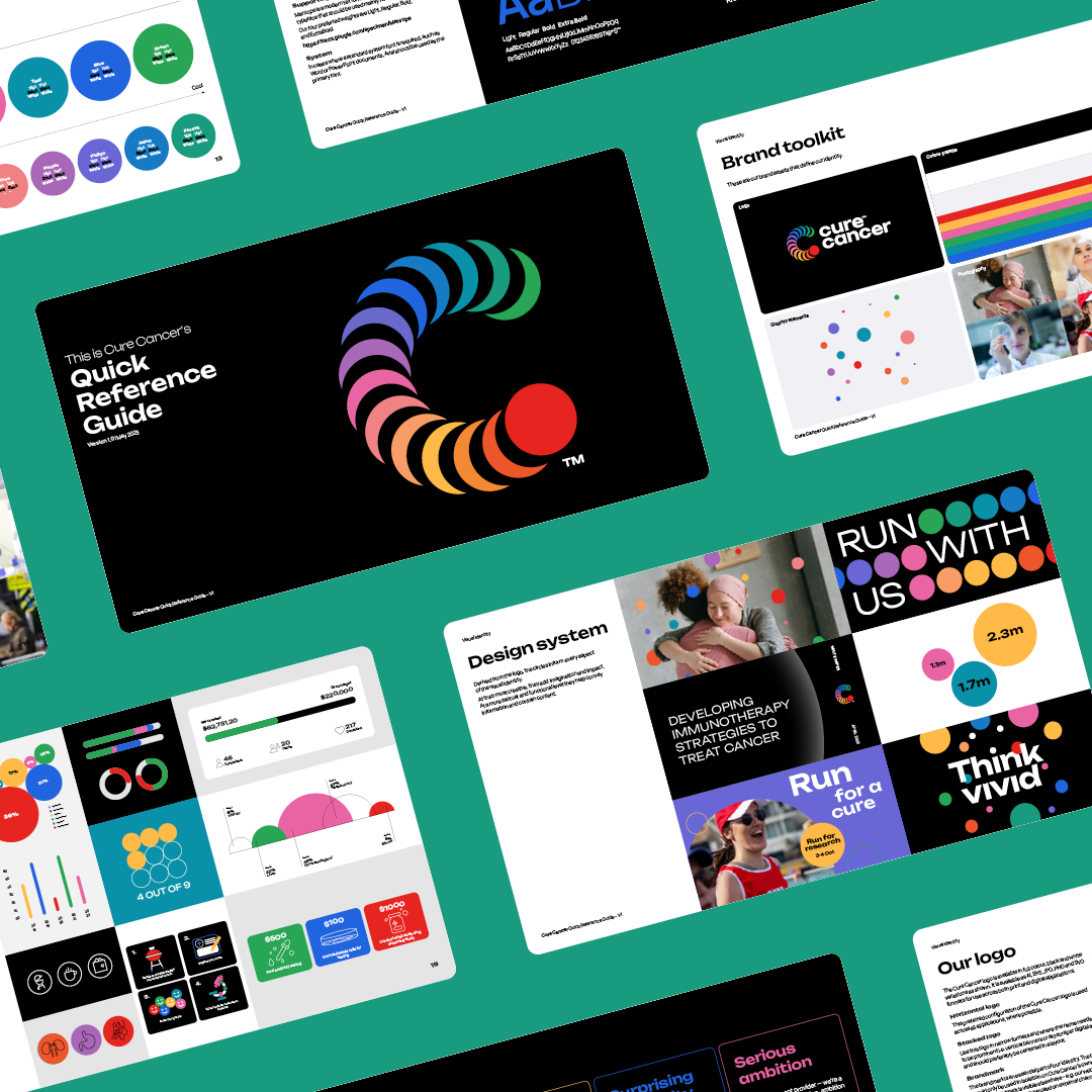
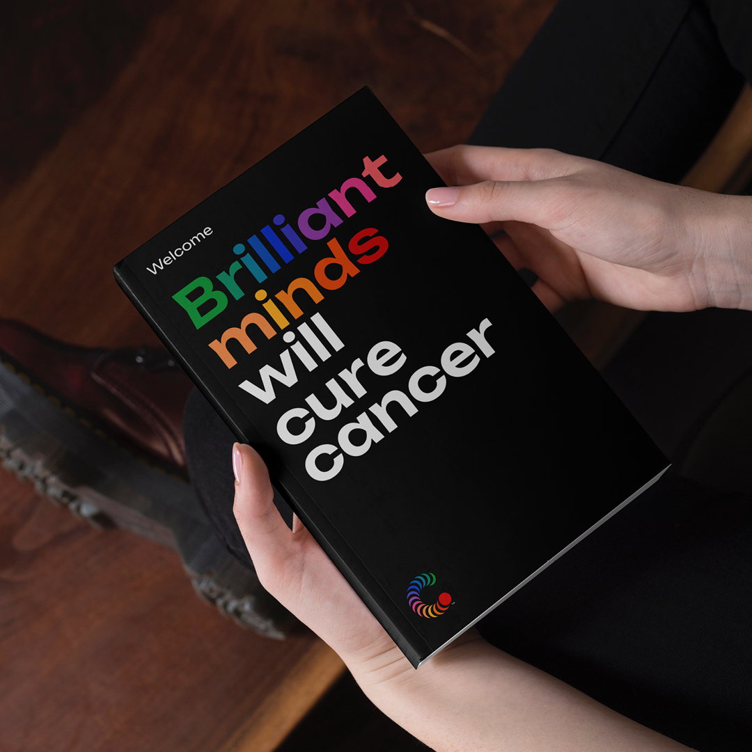
While there are many organisations that support cancer research, Cure Cancer is one that does things differently as they support early-stage researchers in all areas of cancer to constantly look for breakthroughs. To help tell this story, we have brought a new brand strategy to life – a leap of imagination. Based on this we have then looked at revitalising their brand architecture, brand narrative, brand identity, and design system to create a more meaningful and impactful brand.
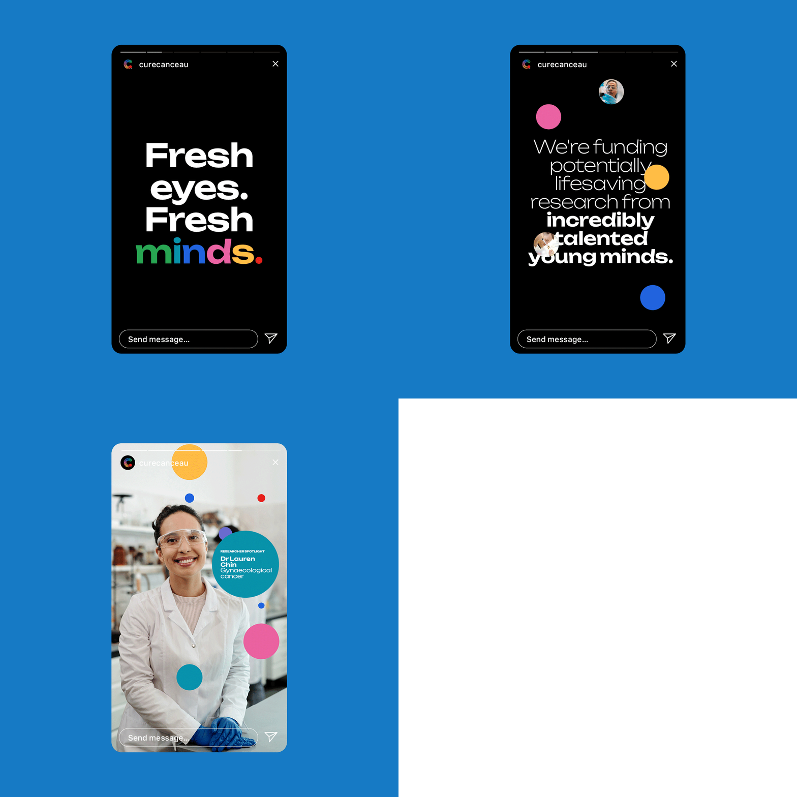
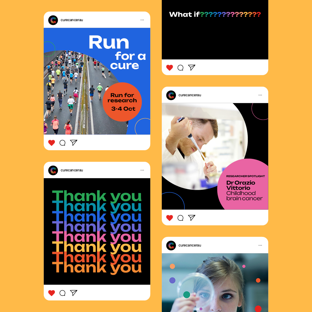
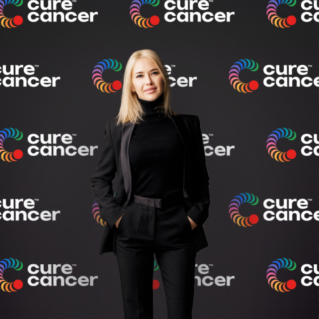
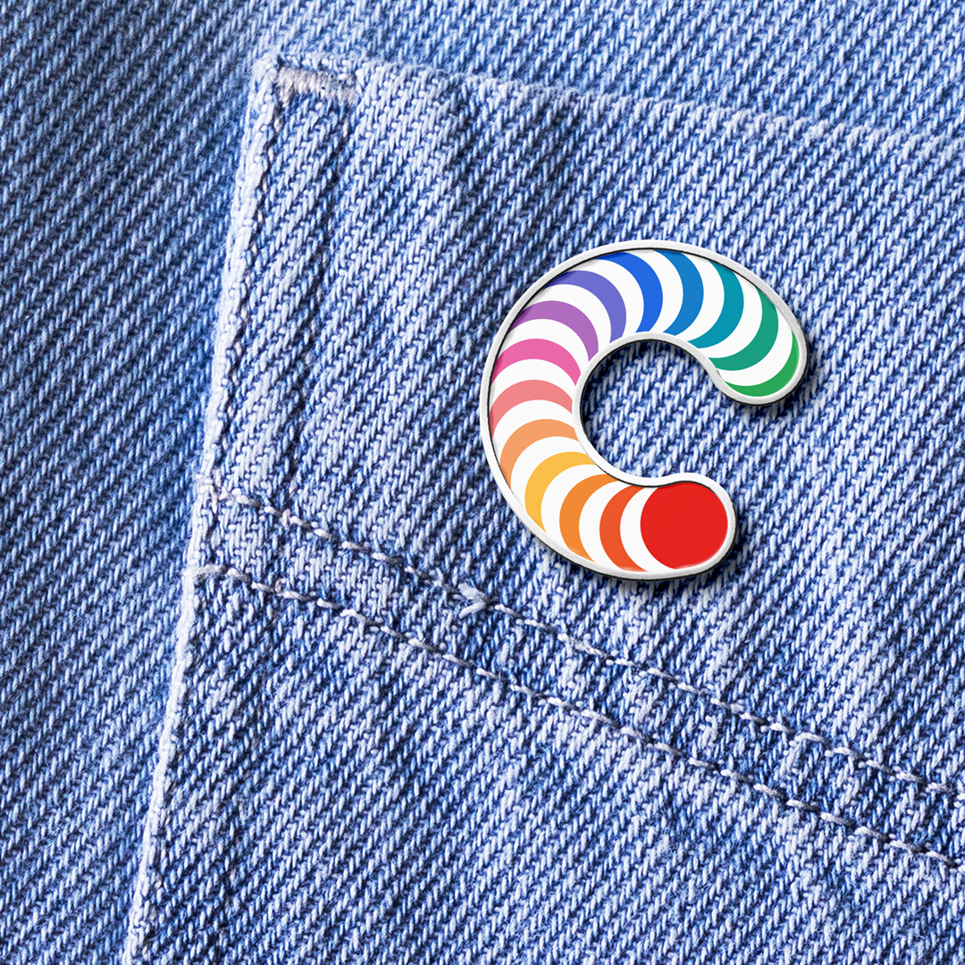
The new Cure Cancer symbol represents a collective force of emerging researchers while each of the colours represents one type of cancer, and they are all connected for a cause as well as representing a sense of progression and constantly looking for game-changing impacts. All their new imageries speak to their personality traits like infectious optimism, surprising creativity, and serious ambition.
We have also adopted a Masterbrand- led approach in their brand architecture so that each product and platform can use elements from the visual identity in ways that best appeal to their target audience. E.g., Game On Cancer uses the young and edgier brand elements, Barbecue uses the fun and social part of the visual identity and World’s Best BYO for a more sophisticated side of the visual identity.
All these elements create a more powerful brand that supports the main idea of the organisation.
Transform Awards (2023): Silver – Best Visual Identity in the Charity, NGO or NFP Sector, Silver – Best Creative Strategy. Rebrand Awards (2024): Distinction.
