Client
Officeworks
Industry
Retail
Revitalising Australia’s office ally
Officeworks has always been a brand that makes bigger things happen. But the pandemic has changed way we work, learn, and create. So, Officeworks needed to change too.
We came on board to help with the rebrand including research, brand strategy, personality, brand voice and visual identity. We discovered that Australians liked and respected Officeworks, but it was missing its spark. The opportunity? Tap into the creativity they inspire, and the joy of getting stuff done.
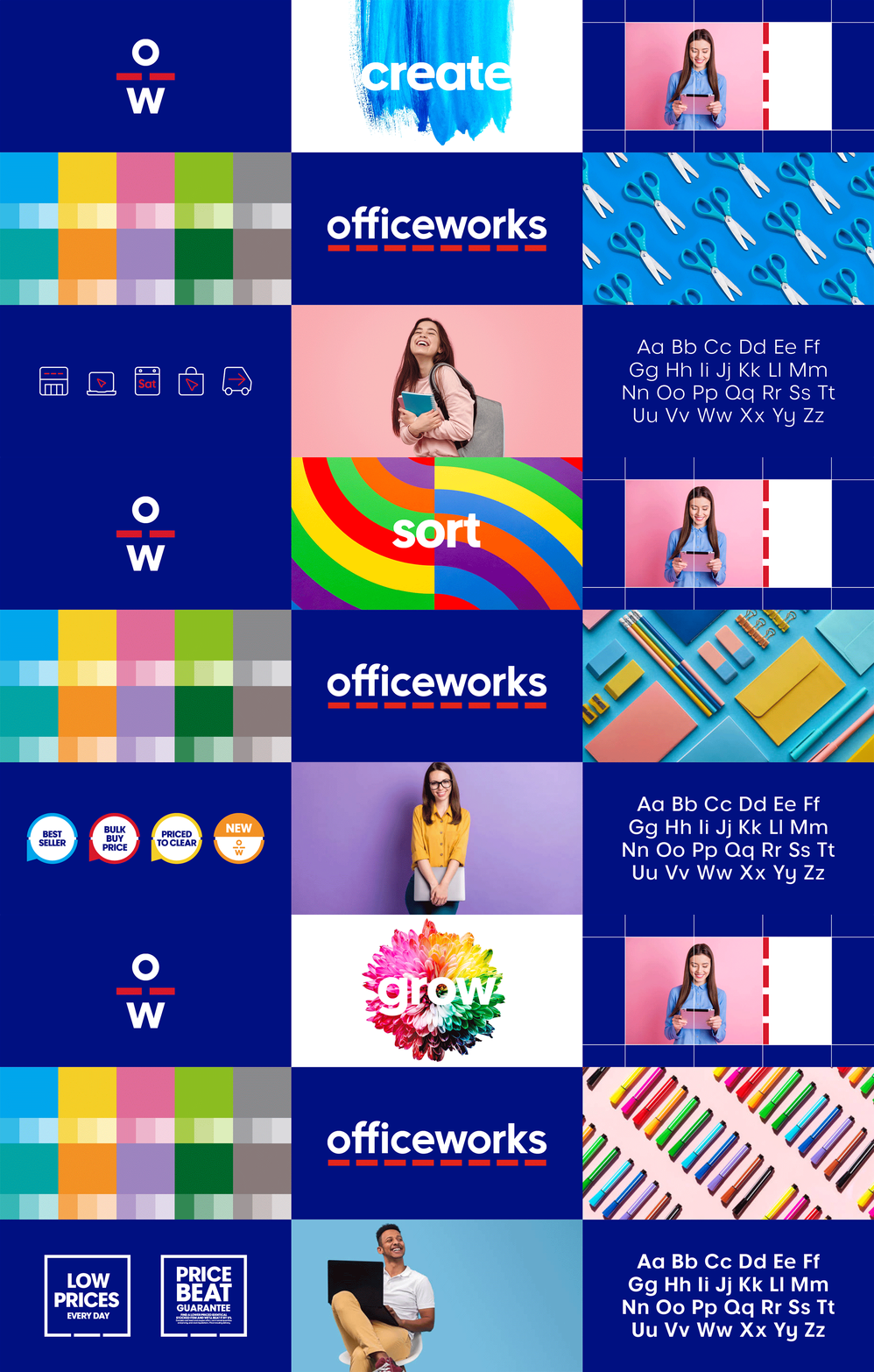
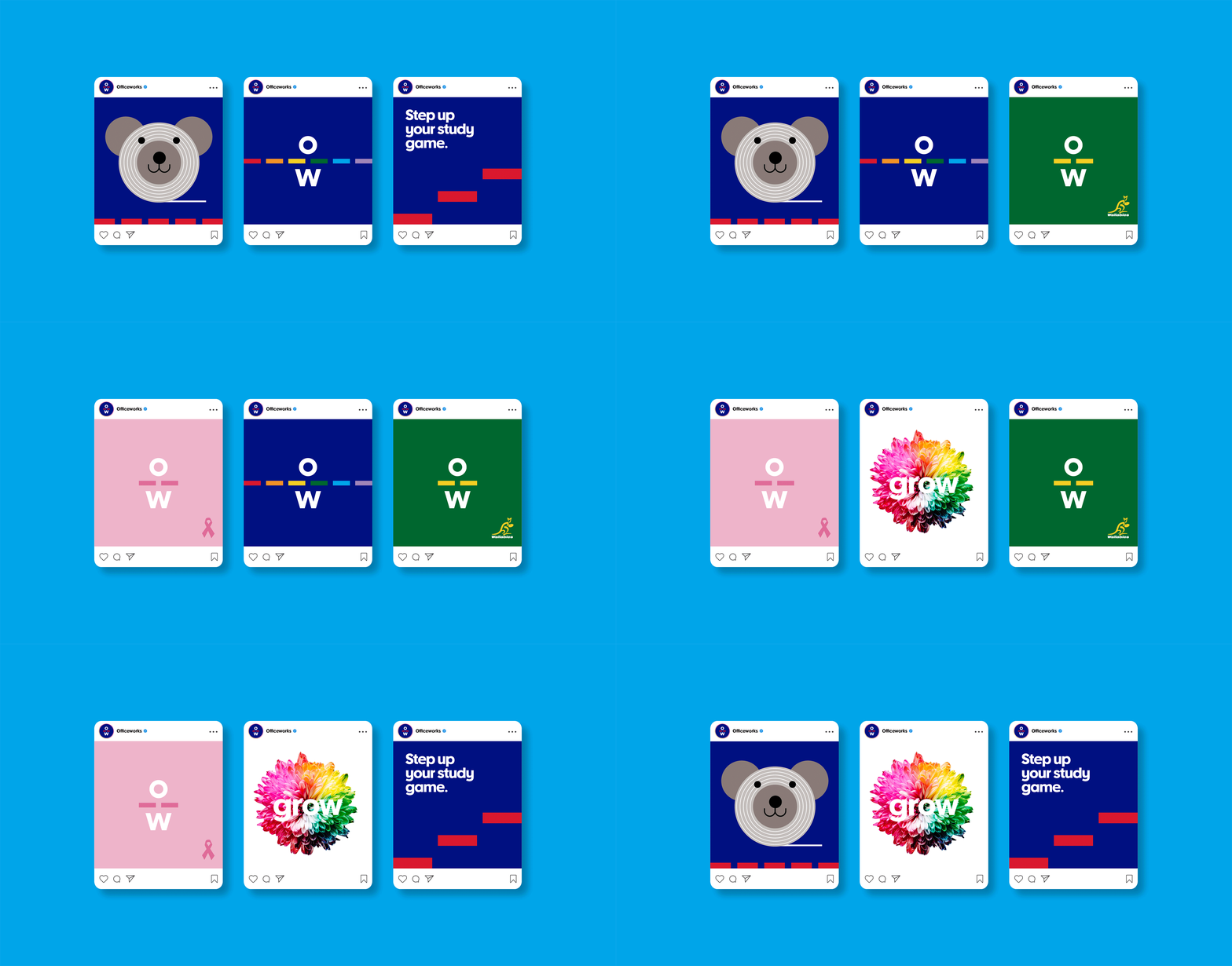
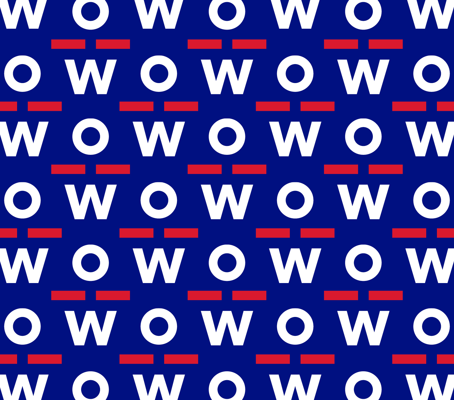
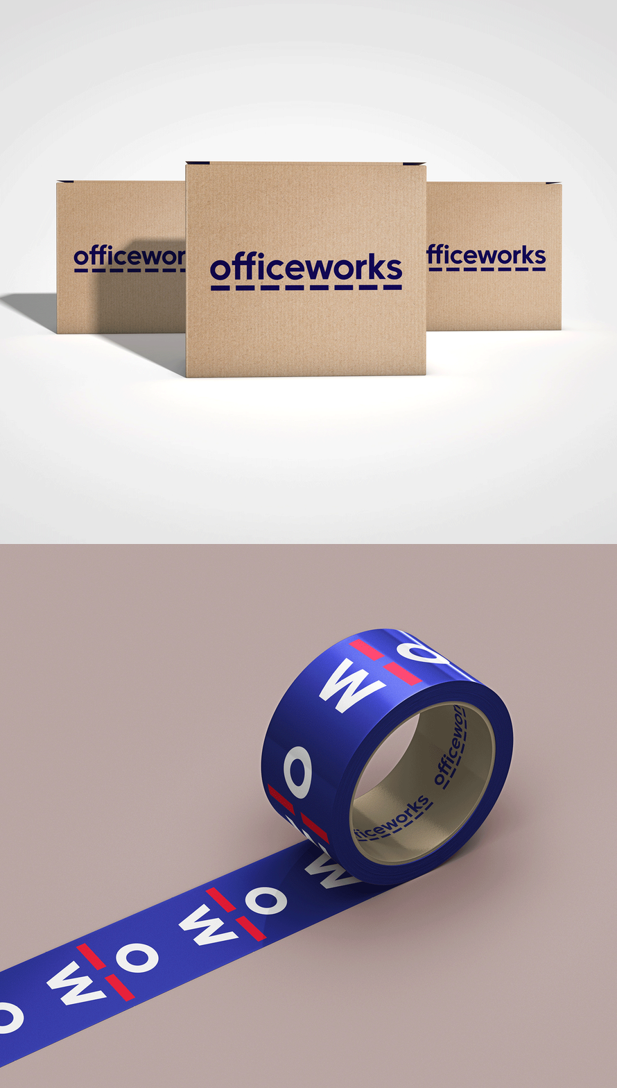
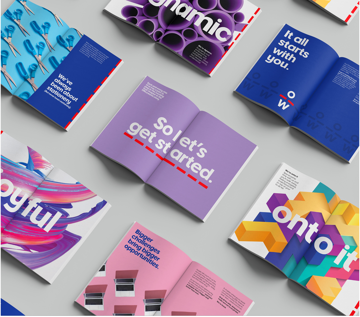
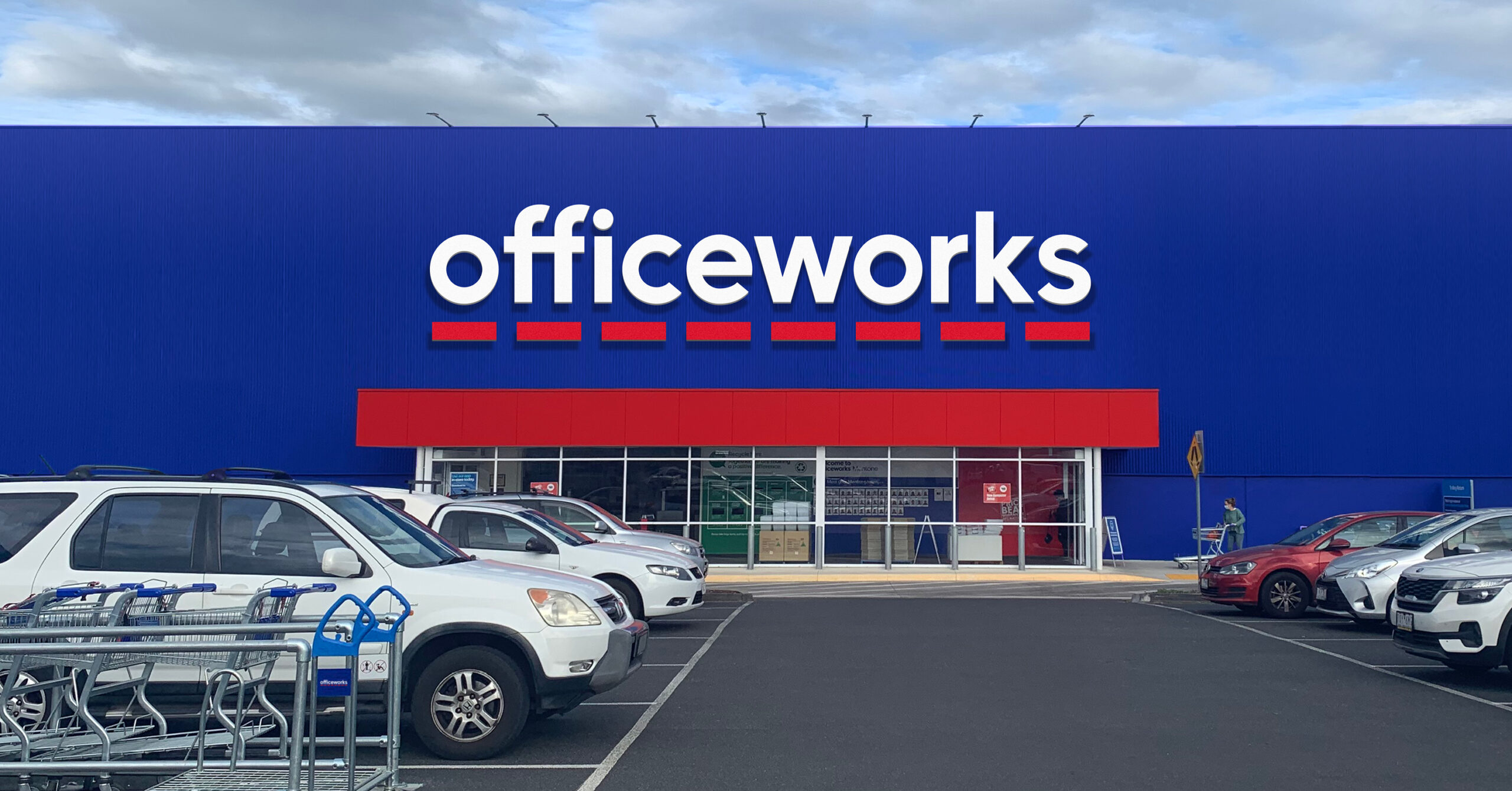
We crafted a dynamic, joyful and onto it personality, matching that sense of possibility and playfulness. And designed a brand identity that embraced their distinctive blue & red and the dash within their logo. It’s a shorthand version that brings impact and a bit of fun to their digital channels and internal communications. A new voice also positioned Officeworks as The Ally of Australians, empowering customers in every way.
We’re proud to say that this work culminated into us winning Officeworks’ New Partner of the Year award.
Revitalising Australia’s office ally
As Australia’s leading supplier of stationery, office supplies, furniture and technology, Officeworks is a brand that makes big things happen – but they needed to bring fresh energy. Evolving from a brand that’s known and appreciated, to loved and preferred.
Our challenge: to shift their brand from a well-known, respected but rationally dominated “big-box” brand to be more emotional, inspirational and personality-driven. So it can effortlessly speak to new customers and categories in a personality-rich, impactful, integrated, omnichannel way.
We ran a collaborative process designed to explore creative opportunities quickly. Using brand archetypes to fully explore the future possibilities of a more emotionally connected and personality rich Officeworks brand.
Each archetype was brought to life with brand idea boards, which we used in co-creation workshops with leaders to explore the strategic and creative opportunities.
We then developed 3 territories which we qualitatively tested with consumers, giving us essential insights into defining the brand strategy, voice and visual identity.
Research showed Australians viewed Officeworks as the quintessential ally in life – like Robin to Batman or Holmes to Sherlock. Our insights team also identified Officeworks have an opportunity to being joy and dynamism to their brand by tapping into the strong sense of creativity and productivity their category delivers to consumers every day.
“Principals were amazing… James Sterling”
The refreshed brand positions Officeworks as an ally for everyday Australians. A partner in creativity and productivity that’s indispensable, onto-it and empowering. With a brand voice crafted to invite customers to explore more possibilities and that provides helpful tips to solve everyday jobs to be done.
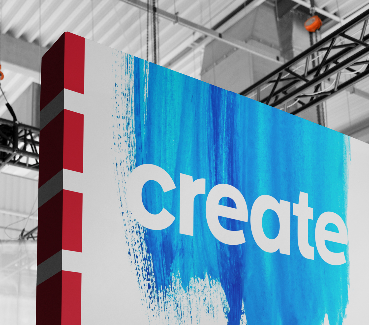
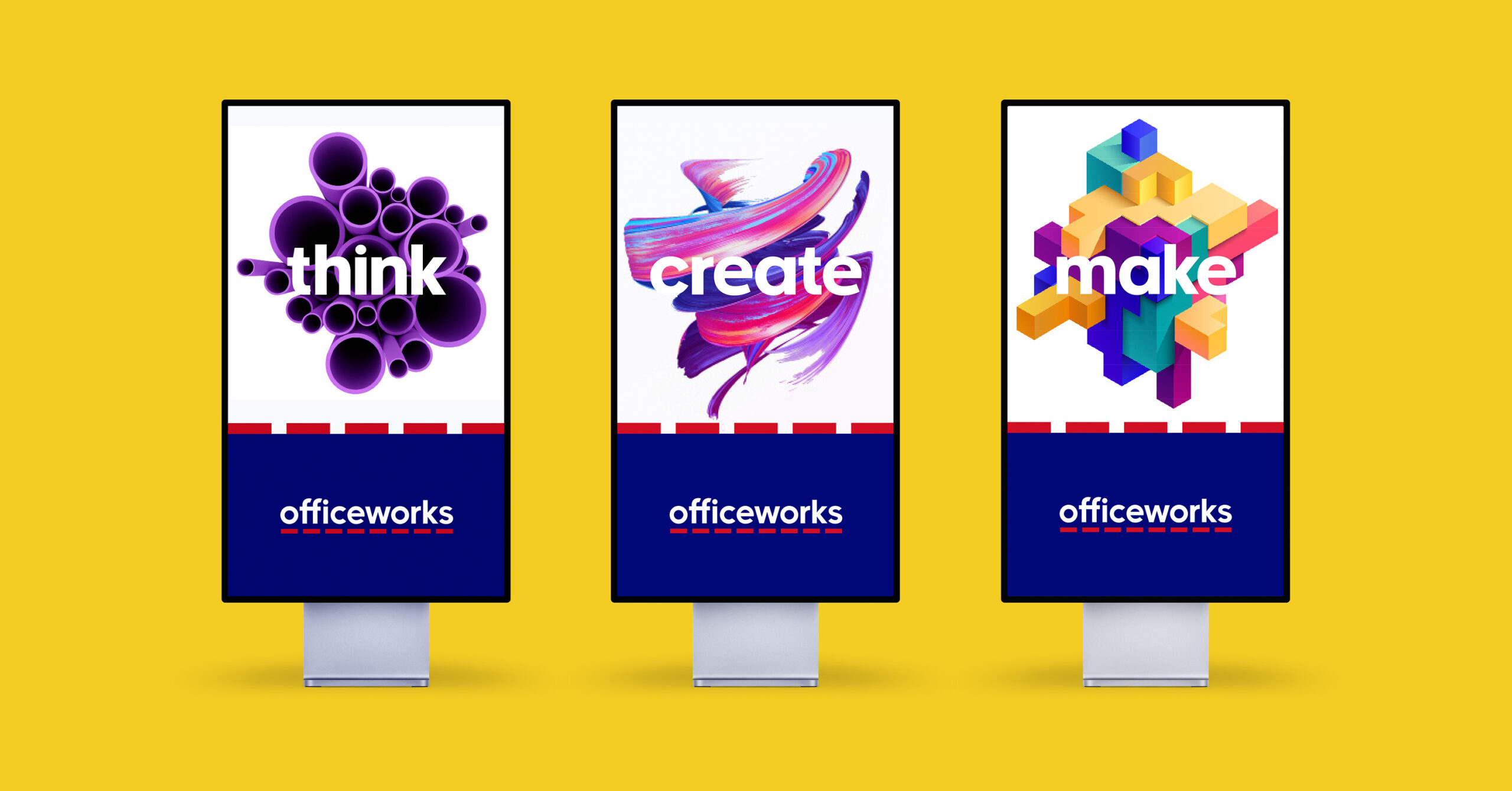
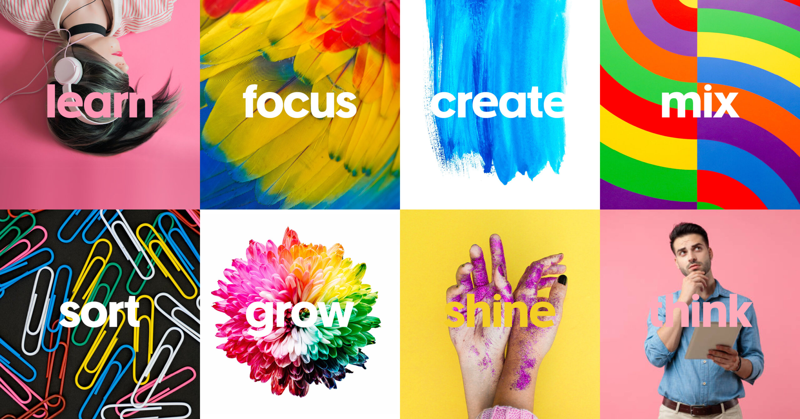
The visual identity refresh amplifies and activates the brand’s iconic blue and the red dash from the logo, driving recognition across all communication tiers and channels – an undeniable but flexible Officeworks presence. Building on these foundational brand codes, we injected passion and dynamism with fresh colours, inspiring product and people imagery and content that captures creativity and possibility.
We boldly dropped the pin from the logo, signaling change, and an increasing shift towards technology and digital channels. Customers saw it as a dated symbol, and the blue and red dash were visual codes equally identified with Officeworks.
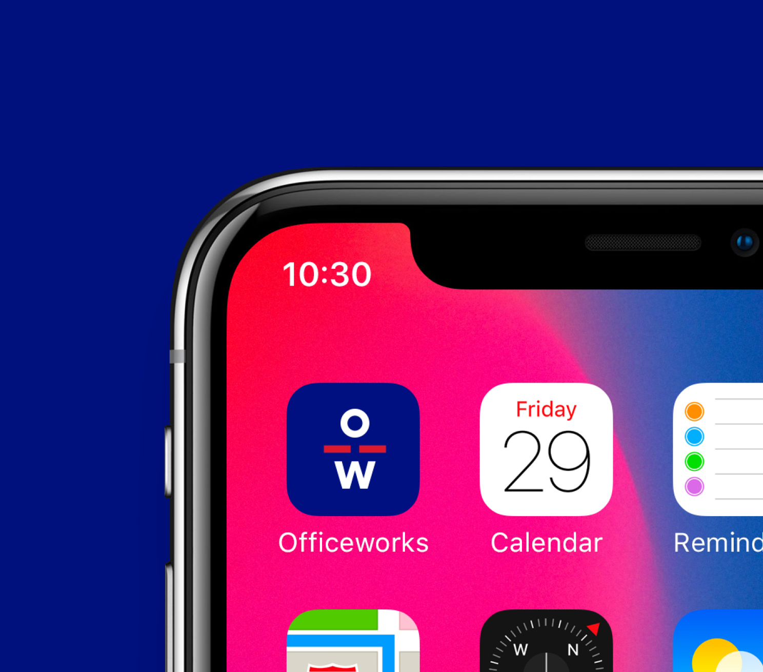
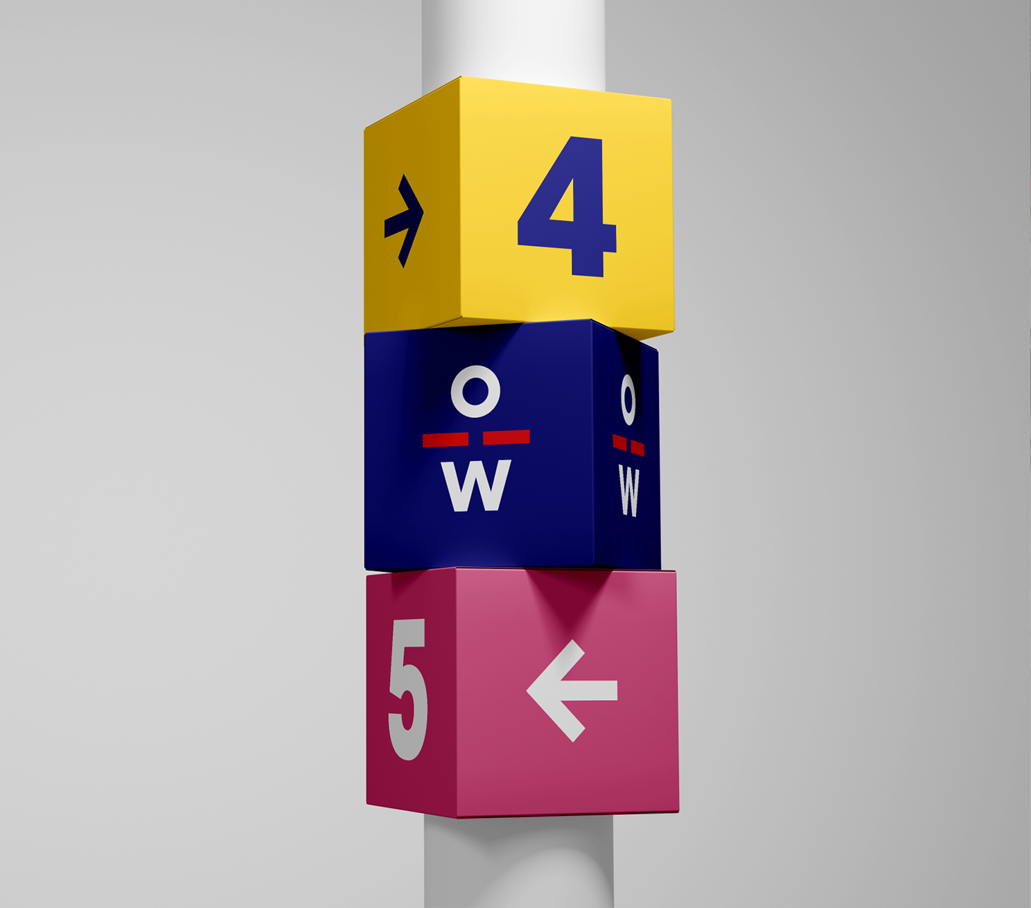
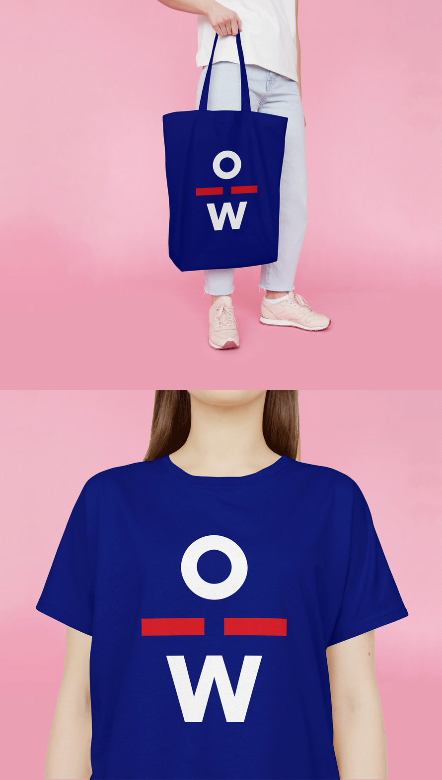
We replaced it with a new brand character derived from the initials of the master logo. It’s a shorthand version that’s been created to be more recognisable in digital channels, bringing a distinctive human touch critical to small formats like favicons and app buttons and to add personality to in-store and internal touchpoints.
Geeks2U
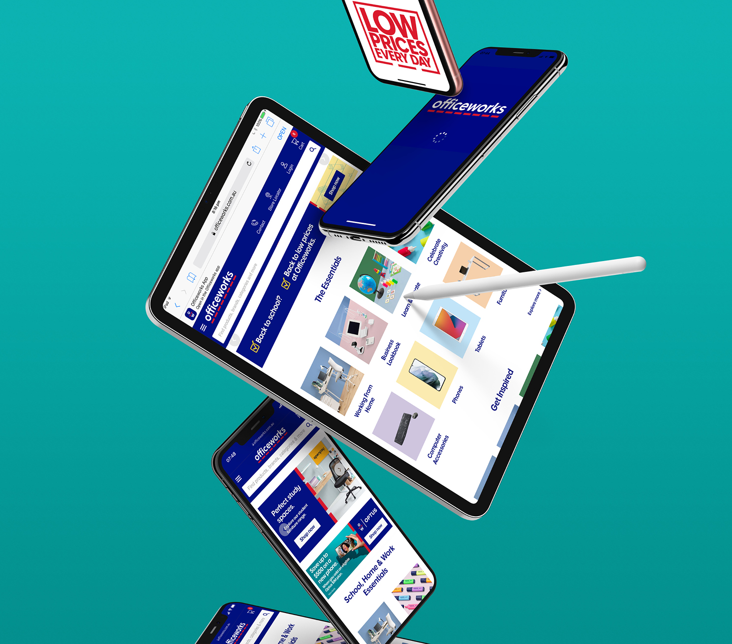
As a recent acquisition for Officeworks we came on board to help transform the Geeks2U brand – with a visual identity refresh, new tone of voice and online user experience upgrade that worked in concert with the Officeworks masterbrand. Working collaboratively, we were able to tap into the personal, proactive spirit of the Geeks2U brand and apply a visual identity and voice that was clear, confident and easily connected to the brand’s diverse customer base.
This was then applied to the Geeks2U site structure – ironing out the kinks in their user experience, streamlining the user interface design and uplifting their overall brand experience.
The result is a cohesive and appealing brand that’s well-equipped for the digital space – and a better reflection of Geeks2U’s exceptional service
Flexiworks/Personas/People & Planet Positive
We’re proud to have established a true partnership with Officeworks, collaborating with teams across the business, solidified by winning ‘Best New Partner in 2021’. Initial in-store market testing of the updated brand identity revealed a more engaging and inspiring experience that’s valued by shoppers, leading to the retailer taking home third place in Brand Finance’s annual “strongest brands” report.
The refreshed brand refresh has a stronger and more flexible Masterbrand framework, allowing new product offerings like Flexiworks, brand acquisitions like Geeks2U and corporate programs like People & Planet Positive to be united coherently and consistently.
Australian Design Awards (2023): Gold – Graphic Design – Identity and Branding – Corporate. Melbourne Design Awards (2022): Gold – Graphic Design – Identity and Branding – Corporate. Rebrand Awards (2024): Merit, Transform Awards (2022) Gold – Best Visual Identity in the Retail Sector. WILD Awards (2023) Silver – Graphic Design – Identity and Branding – Corporate.
